
For those of you who didn’t see the final Intruder episode (what are you waiting for? Watch it here on YouTube), the Absolution is gone for the time being. TOM and SARA have relocated on Shogo 162, a planet that, as some people have mentioned, kind of resembles the planet from the TOM 4 era.
Oh no! Not the dreaded TOM 4 era! We were never supposed to speak of that era!, you might be thinking. Well don’t worry, the new look is much more than just some TOM 4 rehash. Truthfully, the new atmosphere looks awesome, and after continuously being in space ever since Toonami’s [as] launch, it’s a welcome change. Let’s go over some of the details of Toonami’s change, and what I like and don’t like about it.
Shogo 162
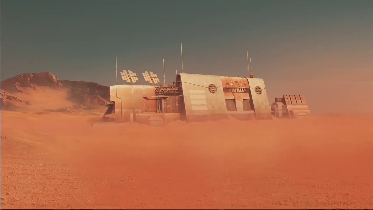
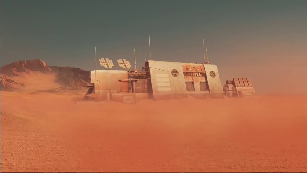
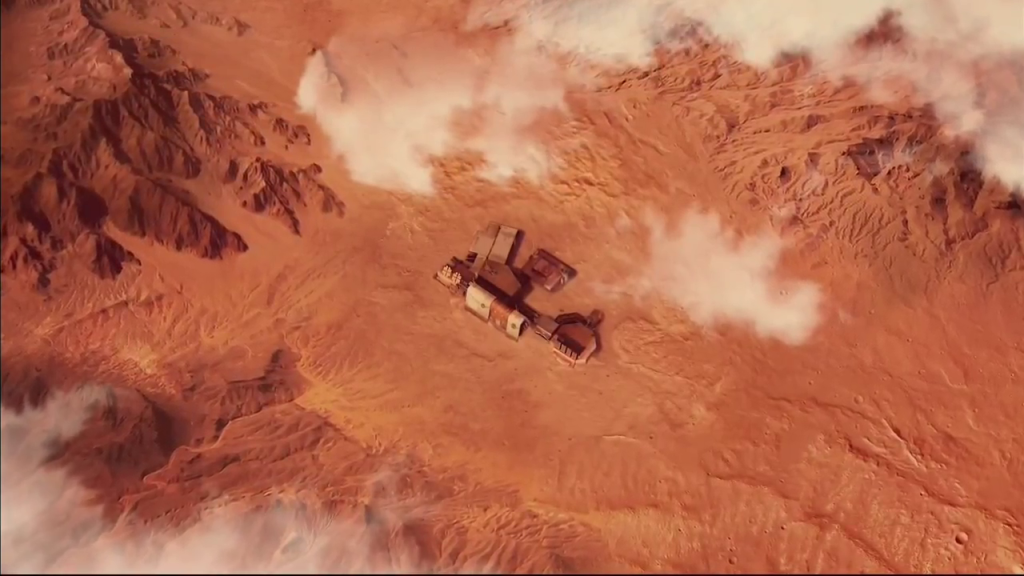
Not much is known about this planet TOM has encountered, but it seems like he and SARA plan to stay here until they can find a new ship. The area they’ve inhabited is dry, barren, and desert-like. It makes perfect sense for Toonami when you think about it– similar to the space atmosphere that Toonami has been known for during most of its run, Shogo 162 has a calming, simplistic mood to it that is just as appealing to the eye as it is soothing to the soul. I would go so far as to say it perfectly maintains Toonami’s futuristic feel just as well as the outerspace look did.
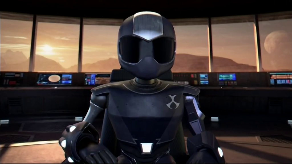
Home Base

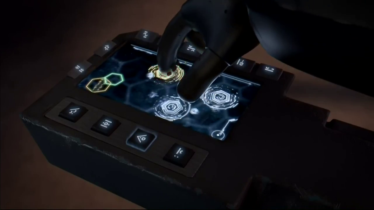
This is where the TOM 4 era resemblance really locks in. Once again, TOM is running Toonami from a base rather than flying in the Absolution. What’s great about this is that there is so much more space in this room for TOM to move around during events such as speeches and game reviews (well, reviews might take place in a different room, but I guess we’ll see?). The gadgets inside the base look fresh and futuristic, especially TOM’s new control buttons (see picture above) which are laid out similarly to the Toonami app. I think that, even though we’ve only had one night of seeing TOM and SARA on this new base, it already feels very much like a home for Toonami.
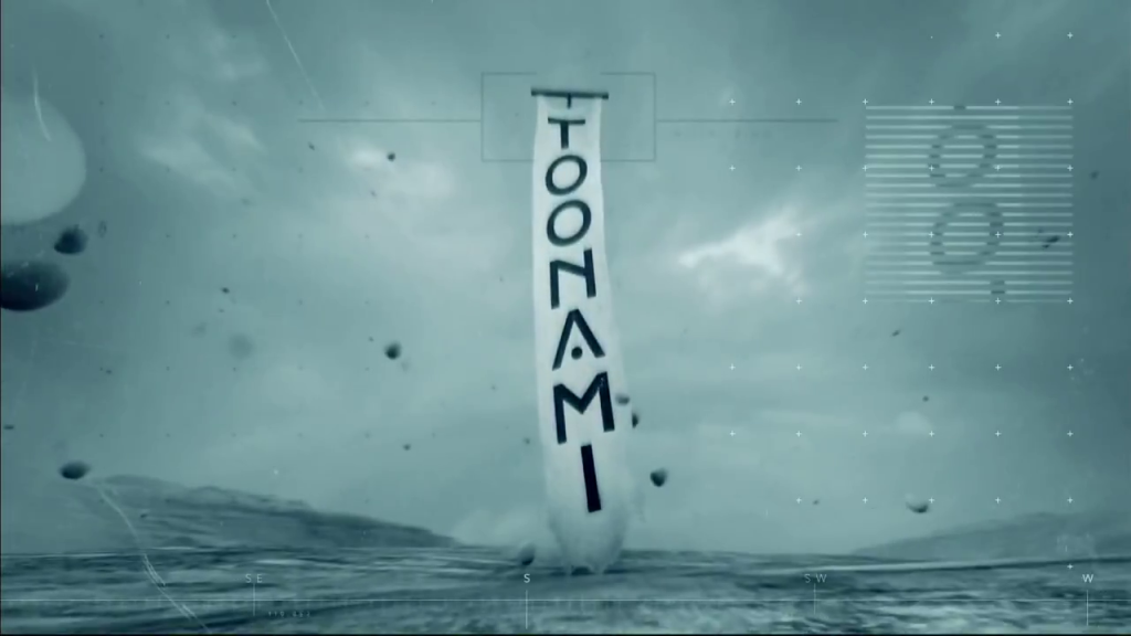
New Logo and Font
![]()

I don’t think they could have possibly created a more fitting logo and font for this new atmosphere. It expresses serenity and calmness, and takes a step away from Toonami’s more robotic look in order to fit the desert environment of the new planet. The only aspect of it that I’m on the fence about is the “A” in “Toonami”. Replacing the middle line with a circle is clever and unique, but perhaps it is too strange. The rest of the letters are somewhat simplistic and this one just sticks out like a sore thumb. But that’s just me being nitpicky; all in all it is an excellent logo and I’m sure anything I don’t initially like about it will grow on me over time.
The font used for the bumpers is slightly different than that used for the logo, but they both symbolize the same sort of serene, laid back atmosphere that fits Toonami’s current look perfectly. Not to mention, it mixes with the background of the bumpers flawlessly.
What Will Happen Next?
Just how permanent is this change? Well, the last Toonami redesign took place in April 2014 and lasted about a year and half (until just now). The one before that started April 2013 and went until April of the next year. So this specific redesign will last a year and a half at the very most, possibly even a year or less. If you remember the last episode of Intruder 2 (again, please watch it if you haven’t already), TOM and SARA talked about being in search of a new ship. It’s possible that next week’s intro will also make some sort of reference to this. Regardless, it is clear that sooner or later, we’ll be back in space again aboard a new ship. So let’s take some time to really appreciate this new look for Toonami, because it really is something unique and it’s clear that a lot of effort was put into it. In 2016 we expect to see even more of this base, including maybe a room for game reviews, and we also hope that next week it will be given a name. In the meantime, you can watch all the bumps that aired last week in this compilation, thanks to CabooseJr. You can also check out the gallery below which has some snapshots from the broadcast.
What are your thoughts on the new look? A welcome change or an unnecessary one? Let us know all your thoughts in the comments below.