Written by Fabian LeFevre
The Promised Neverland is a fantastically produced series that aired on Toonami back in April of 2019. Production handled by CloverWorks and Directed by Mamoru Kanbe; the show tells a story about children living in an orphanage where two of the children, Norman and Emma, find out that the house they reside in is a farm meant to raise the children as products for harvest. Following this discovery, Norman, Ray, and Emma quickly start devising a plan to escape this house they have called home along with all the other children. They must do this as discreetly as possible to avoid becoming food for Demons should their plan be discovered.
The story is amazingly told as the kids devise their plan and make adjustments for any new piece of information and setbacks that may arise. These factors are accompanied by incredible artwork and animation that incorporates both 2D and 3D elements. What caught my attention are the stellar shot compositions that can be found in each episode.
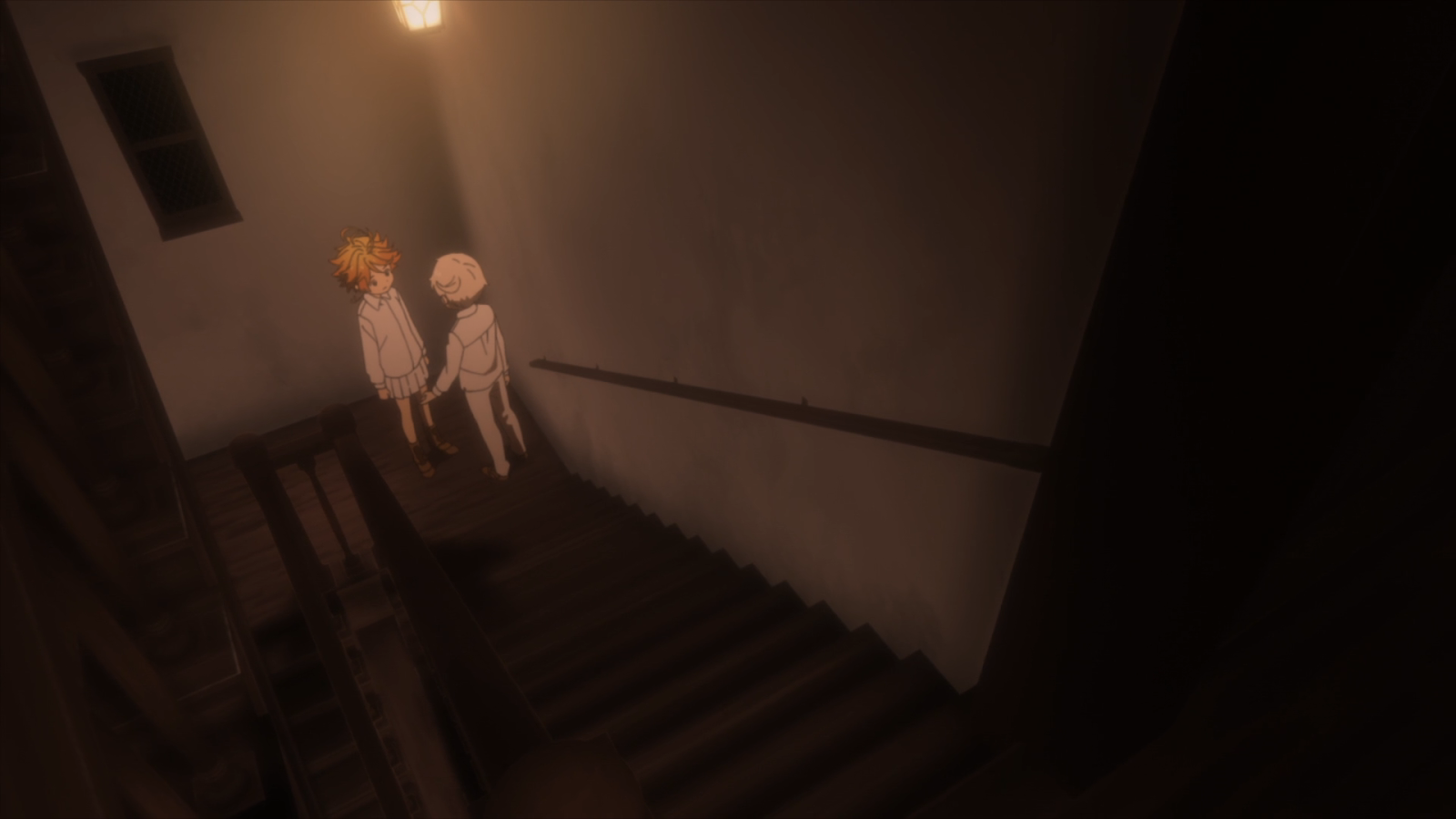
These shots are very well constructed using each part of their design to create an appealing image. This shot (above) is using an angled 1-Point Perspective with the Vanishing Point behind Emma. The lines of the handrail and the railing on the stairs draws our eyes toward Emma and Norman. The critical thing to note is the positioning of the camera, placed at the top of the fleet of stairs. The camera is also not level with the floor. It’s as if someone is peering over the next flight of stairs and is looking at Emma and Norman. Currently, no one is there, but this type of shot where the camera is looking at the characters from a distance highlights how Emma and Norman need to speak about their plan as secretly as they can. This shot gets used again when Isabella (Mom) questions Emma and Norman about whether or not they were at the gate.
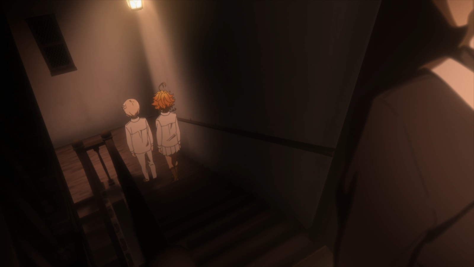
More of these distant shots are used throughout the first half of the series suggesting that someone is watching them.
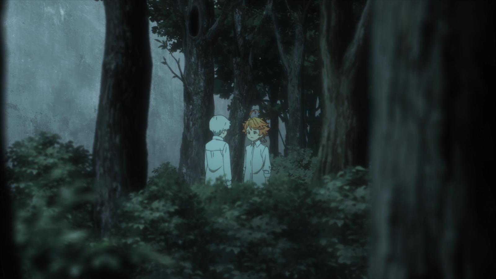
This shot (from the same episode) is looking at Emma and Norman flat on the ground, slightly behind the tree on the right frame. Moments later, Ray approaches Norman and Emma from the same direction of the viewpoint for the shot above. This time someone was watching them from afar.
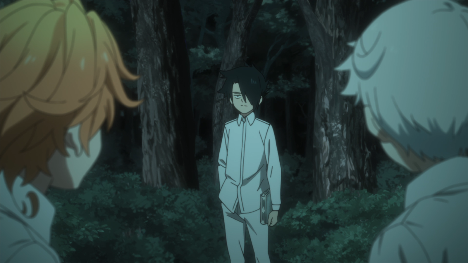
We see a different variation of this type of shot in the next episode (episode three), as Ray, Norman, and Emma discuss how to deal with the tracking device in their left ears.
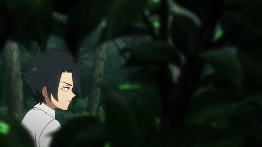
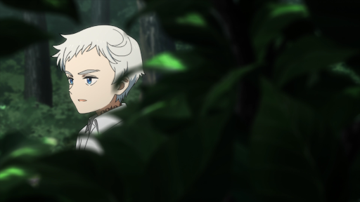 Screenshots above are from Episode 3 “181045” via CloverWorks
Again, these shots highlight how delicate their situation is and how careful they need to be to avoid getting caught. Here, the camera is placed in the bushes surrounding the characters. You can’t tell with the image of Emma, but when we see Norman and Ray, the camera is entirely still. For the shot of Emma, the camera moves up to the position of the image above and shakes slightly. This movement would suggest that someone is indeed watching them and that this person is more interested in Emma. We would later learn that Gilda has been wanting to talk to Emma about how Emma has been behaving lately. This style of storytelling could mean that the person suggested to be watching Emma in this shot is Gilda.
We get a set of shots like this again in episode six after Don and Gilda confronted Ray, Norman, and Emma about what they were hiding from them. In the series of shots below, we see that Sister Krone was watching the group. She reveals that she was there by the end of the episode.
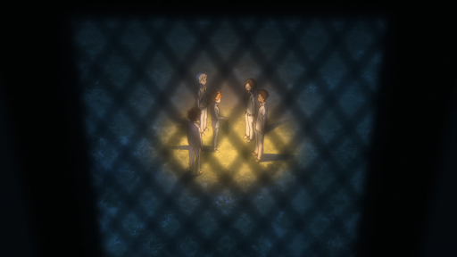
 Screenshots above are from Episode 6 “311045” via CloverWorks
I’ve covered how the series emphasizes its main scenes for meetings in secret to discuss how to conduct the escape, how the characters will approach things going forward, as well as scenes where the characters are vulnerable to being discovered. What about shots that emphasize the story of the moment?
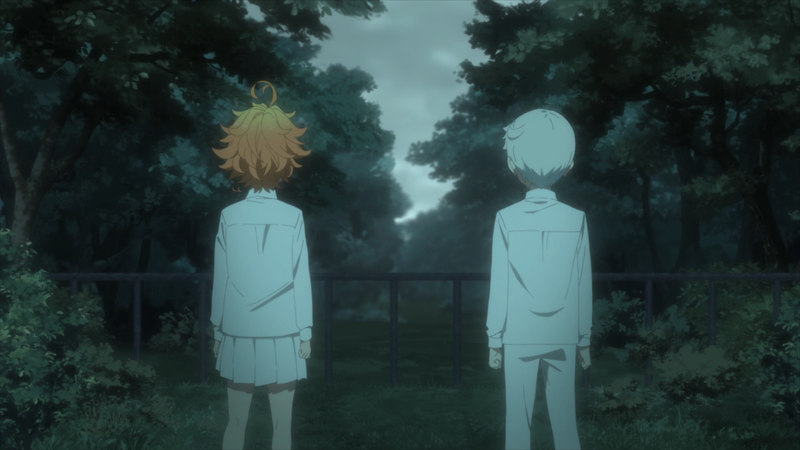
These two images tell the difficulty of the two obstacles Emma and Norman must overcome. First is the small fence they’ve been told to never cross for their entire lives, as illustrated by the first image. Because the kids are taller than the barrier in both height and the frame of the shot, this hurdle is not daunting to them. The primary design choice here is how the camera views the prominent elements, the fence, and the kids. If the director wanted to have the fence look like a more significant hurdle than it is, the camera could’ve been placed at a skewed angle looking at Norman and Emma. They made the fence higher in the frame than the kids are.
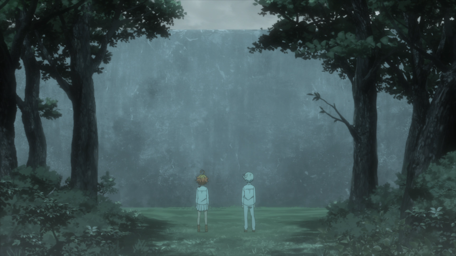
Past the fence is the wall, which is the kids’ primary obstacle to escaping. In the frame of the second shot above, it’s much taller than the kids (which is apparent with the trees being shown to go just above it). This shot illustrates the drastic difference in size between the kids and the wall. When compared to the fence, the wall is far more imposing due to the director’s choice in maintaining a distant shot exhibiting the grand scope of the wall. If the director wanted the wall not to look so imposing, they could’ve made the kids larger by placing the camera closer to the kids and at a low angle so that the wall would still be in the frame of the shot.
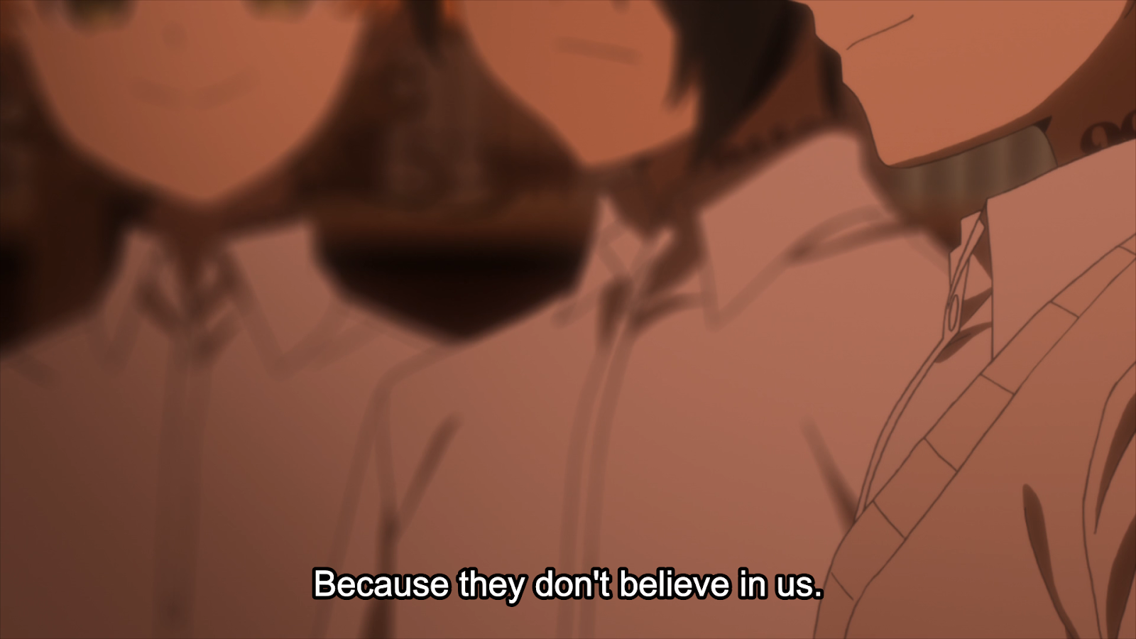
In this shot, Emma, Ray, and Norman have their faces cut off by the top of the frame. Don and Gilda have just finished looking through the secret room Isabella has, and Don is remarking how he feels about Emma, Ray, and Norman not giving them the full picture. Cutting off the faces shows how Don feels about them keeping the whole truth of the House and Mom from Gilda and himself. This reaction means that Don is unable to understand and see everything that they do, sensing a lack of trust from Emma, Ray, and Norman.
Faces, especially the eyes, are a vital part of understanding and connecting with a person. If you’ve seen the film A Silent Voice, you should remember how the main protagonist doesn’t look anyone in the face, and the faces of those around him are obscured. This idea is utilized to show how he isn’t able or is unwilling to connect to those around him. Within Don and Gilda’s perspective, the omission of critical details about their situation elicits a sense of distrust, which causes a feeling of disconnection.
The next shot isn’t super active, but it conveys a simple idea well enough.
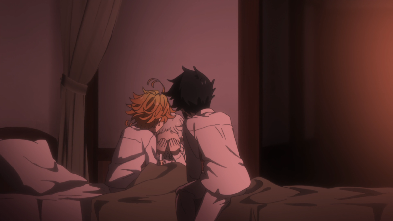
Before this shot, Norman has been dealing with the fact that he will be shipped out for harvest tomorrow. He decided to let himself be shipped and die, but Emma and Ray won’t have it and convince Norman to try and escape on his own. The idea being conveyed here is that Emma and Ray are going to protect Norman. The emotional appeal is done by Emma and Ray surrounding Norman with their bodies. No gap between Emma and Ray can lead to Norman, which enforces this idea.
The reason why the shot from episode nine is not strong is due to the imbalance of the frame. This imbalance is created by the negative space and light bloom on the right side of the frame. This choice makes it heavy on the right and pulls away from the essential aspects of the shot, which are Emma, Norman, and Ray.

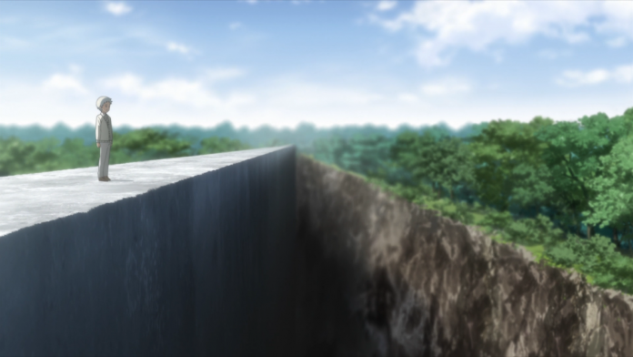
Finally, the image above shows how Norman has successfully climbed to the top of the wall only to find a cliff between him and escape. This shot highlights the massive gap there is to overcome to escape from the Farm. A Vanishing Point is used again to show that the chasm stretches down the wall. Norman looks small juxtaposed to the wall and the opposing cliffside. This revelation proves to be too difficult for him alone, requiring the development of a new strategy with the other kids.
Shot composition is one of the most important tools any film has when constructing a scene or story. Well constructed images make for appealing visuals for the audience to experience. Poorly constructed shots can break a scene/moment. The use of a shot has a lot to take into consideration.
What is in the scene? Who is in view? What is this scene telling viewers? What is the story of the scene? How does one shoot or construct the scene? What design concepts can be used to enhance the overall story or moment?
When it comes to the design concepts, I talked about perspective, size, and where the important subjects are placed in the frame, but there are more used in The Promised Neverland.
You see many examples of simple design concepts used in this series that truly bring it to life.
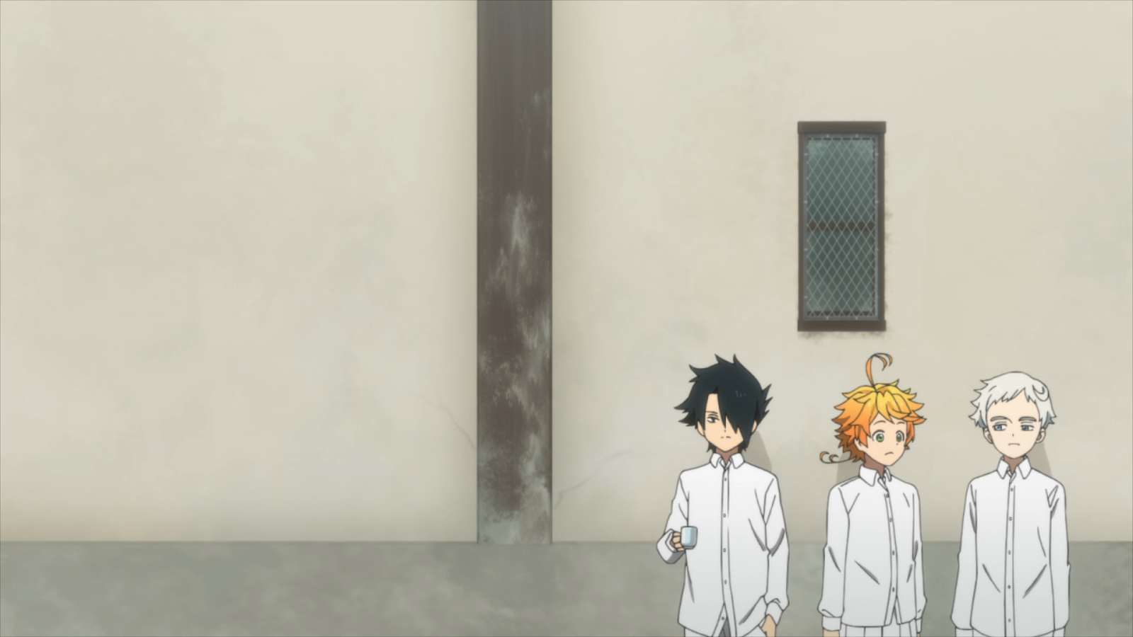
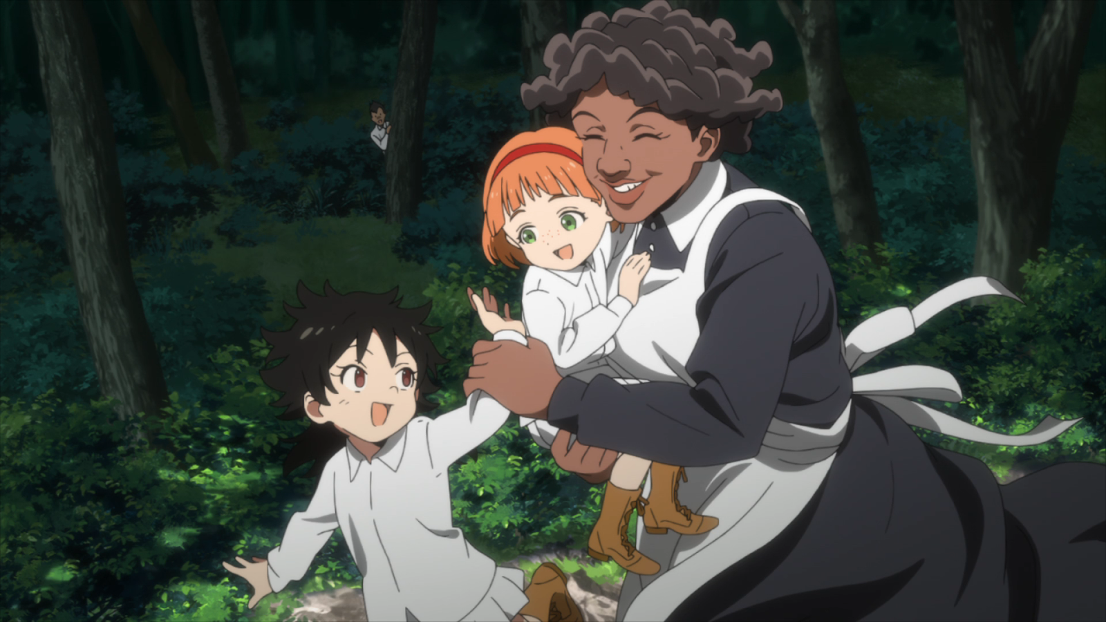
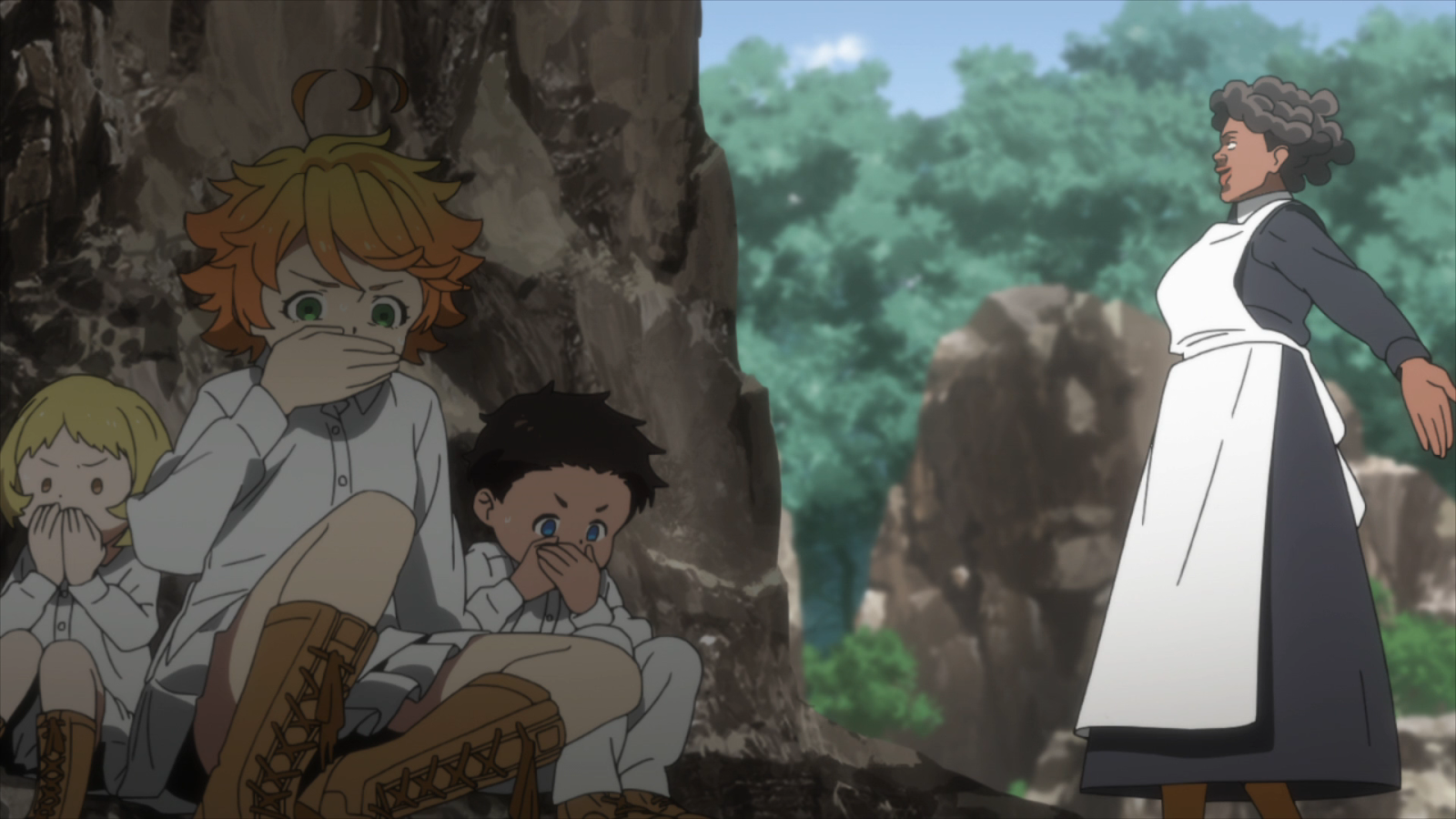
The Promised Neverland used these design principles and more to create amazingly crafted shots that are more than just good to look at but are also enhancing and emphasizing the story of the series. These choices can be attributed to the excellent direction and storyboards created by Director Mamoru Kanbe and Storyboard Artist Yuuki Itou. I haven’t read the manga by Kaiu Shirai, but I can imagine a lot of these images come from the manga series distributed by Shonen Jump.
The Promised Neverland is currently rerunning on Toonami Saturday Nights at 3:30 am. Season Two is scheduled to begin airing in Japan sometime in October 2020. There is no confirmation as of yet for a Toonami airing, as it is way too early for that. I look forward to seeing more of what The Promised Neverland has to offer in both its story and visual design.
I hope you enjoyed reading about the design concepts for Shot Composition that stuck out to me in regards to The Promised Neverland. I hope to do something like this again soon.
Fabian LeFevre is a contributor to toonamifaithful.com. Check out his YouTube channel as well as his Twitter @Faboover
References:
https://www.animenewsnetwork.com/news/2019-03-28/the-promised-neverland-anime-gets-2nd-season-in-2020/.145116
https://myanimelist.net/anime/37779/Yakusoku_no_Neverland/characters#staff
https://www.adorama.com/alc/what-is-balance-in-photography

